In this tutorial we will build the frontend for a modern event management app using React, Tailwind CSS, and React Router. We will focus on using the most important features of React that you will need to build a modern web application.
Table of contents
Open Table of contents
- Project Setup
- ✅ Step 1: Create a Vite Project
- 🎨 Install dependencies
- 📄 Configure Tailwind CSS
- 📁 Set Up Project Structure
- Changes made to the api
- Running the API locally
- Setup React Router
- 📄 Creating the Header Component
- 🔐 Authentication with React Context
- API client
- Login and Register Pages
- Protecting routes & logging out
- 📄 Creating the Events Page
- 📄 Showing my events data
- Creating events
- 📄 Showing event details
- Edit event page
- Updating header styling & mobile responsiveness
- 🎉 Conclusion
📱 What We’ll Build
By the end of this series, you’ll have a fully functional frontend where users can:
- Register and log in
- View all events
- See what events you are attending
- Create, edit, and delete events
- Manage event attendees
Project Setup
We will use Vite for this project. If you are not familiar with Vite, it is a build tool that let’s you create modern web applications with ease. It generates a project structure based on the template you choose. Comes with a dev server that automatically reloads the page when you make changes to the code. Gives you a optimized production build when you want to deoploy with a single command.
✅ Step 1: Create a Vite Project
We’ll begin by creating a new Vite app we will use the React template with TypeScript. We will also use the SWC compiler for faster build times.
npm create vite@latest event-app -- --template react-swc-ts
cd event-app
npm install
Start the development server to confirm everything is working:
npm run devIf you visit http://localhost:5173 you should see the default Vite page.
🎨 Install dependencies
We will use Tailwind CSS for styling and React Router for routing. We will also use clsx for conditional classes and lucide-react for icons.
npm install tailwindcss @tailwindcss/vite react-router-dom clsx lucide-reactThe idea is to keep the dependencies to a minimum and focus on core functionality of React.
📄 Configure Tailwind CSS
Update your vite.config.ts file to enable Tailwind in all relevant files:
import { defineConfig } from "vite";
import react from "@vitejs/plugin-react-swc";
import tailwindcss from "@tailwindcss/vite";

export default defineConfig({
  plugins: [react(), tailwindcss()], // add tailwindcss plugin
});
Remove the default styles from src/index.css and src/App.css.
Now, update your src/index.css file to include Tailwind’s base styles:
@import "tailwindcss";Update app.tsx remove all the code and add the following:
function App() {
  return (
    <h1 className="text-3xl font-bold text-blue-600 underline">Event app</h1>
  );
}

export default App;
If you now visit http://localhost:5173 you should see the text “Event app” in blue with additional styling.
📁 Set Up Project Structure
To keep things organized, let’s create some new folders in src/:
src/
├── api/          // API request helpers
├── components/   // Reusable UI components
├── pages/        // Route-based pages (Login, Register, Events)
├── utils/        // Utility functions (e.g., auth, formatting)
├── hooks/        // Custom hooks
├── contexts/     // Contexts for authentication
This structure will make it easier to scale and maintain the app as we build more features.
Changes made to the api
If you been following along with creating the API Rest API in Gin, I had to do some changes to the API to make it work with the frontend.
React Event App Source code
- Added userId to login response.
- Updates dates format for event to also include the time.
- Adds endpoints to get all users.
- Enable CORS so the frontend can access the API.
Don’t worry about these API changes if you’re only building the frontend. This tutorial focuses on the frontend part, and we’ll be using the API as our data source.
Running the API locally
If you have not already, you can run the API locally by following the instructions in the Rest API in Gin.
To be able to run the API locally, you need to have Go installed. You can download it from here.
- Clone the repository
git clone [email protected]:patni1992/Rest-api-in-go-gin.git- Change directory to the repository
cd Rest-api-in-go-gin- Run migrations
go run ./cmd/migrate up- Run the API
go run ./cmd/apiit should start running on port 8080.
Setup React Router
Inside src/app.tsx we will setup the React Router. Add the following code:
import {
  BrowserRouter as Router,
  Routes,
  Route,
  Navigate,
} from "react-router-dom";
import { EventsPage } from "./pages/EventsPage";
import { MyEventsPage } from "./pages/MyEventsPage";
import { LoginPage } from "./pages/LoginPage";
import { RegisterPage } from "./pages/RegisterPage";
import { EventDetailsPage } from "./pages/EventDetailsPage";
import { EditEventPage } from "./pages/EditEventPage";

function App() {
  return (
    <div className="min-h-screen bg-gray-50">
      <Router>
        <main className="container mx-auto px-4 py-8">
          <Routes>
            <Route path="/" element={<EventsPage />} />
            <Route path="/my-events" element={<MyEventsPage />} />
            <Route path="/events/:eventId" element={<EventDetailsPage />} />
            <Route path="/events/:eventId/edit" element={<EditEventPage />} />
            <Route path="/login" element={<LoginPage />} />
            <Route path="/register" element={<RegisterPage />} />
            <Route path="*" element={<Navigate to="/" replace />} />
          </Routes>
        </main>
      </Router>
    </div>
  );
}

export default App;
We create a BrowserRouter to wrap the app and the Routes to define the routes. The Route component is used to define the path and the element to render when the path is matched. So when the user visits for example /my-events the MyEventsPage component will be rendered. The Navigate component is used to redirect to a different path. We use this to redirect to the home page if the user visits a non-existing path.
Let’s create the pages for the routes.
// src/pages/EventsPage.tsx
export function EventsPage() {
  return <div>EventsPage</div>;
}

// src/pages/MyEventsPage.tsx
export function MyEventsPage() {
  return <div>MyEventsPage</div>;
}

// src/pages/EventDetailsPage.tsx
export function EventDetailsPage() {
  return <div>EventDetailsPage</div>;
}

// src/pages/EditEventPage.tsx
export function EditEventPage() {
  return <div>EditEventPage</div>;
}

// src/pages/LoginPage.tsx
export function LoginPage() {
  return <div>LoginPage</div>;
}

// src/pages/RegisterPage.tsx
export function RegisterPage() {
  return <div>RegisterPage</div>;
}
If you now open the browser and try to navigate to the different pages for example /events. You should see the page content.
📄 Creating the Header Component
Currently we have no navigation. Let’s create a simple header. Inside src/components/header/Header.tsx add the following code:
import { Link } from "react-router-dom";

export function Header() {
  return (
    <header className="flex items-center justify-between bg-white p-4 shadow">
      <h1 className="text-xl font-bold">Event App</h1>
      <nav className="flex items-center gap-4">
        <ul className="flex gap-4">
          <li>
            <Link to="/">All Events</Link>
          </li>
          <li>
            <Link to="/my-events">My Events</Link>
          </li>
          <li>
            <Link to="/login">Login</Link>
          </li>
          <li>
            <Link to="/register">Register</Link>
          </li>
        </ul>
      </nav>
    </header>
  );
}
Here we are using the Link component to navigate to the different pages. The Link component from React Router provides client-side navigation without page reloads, unlike regular <a> tags.
Let’s update the App.tsx file to include the Header component.
import { Header } from "./components/header/Header";

function App() {
  return (
    <div className="min-h-screen bg-gray-50">
      <Router>
        <Header />
        ... rest of the code
      </Router>
    </div>
  );
}
The Header will be rendered in all pages and we can navigate to the different pages by clicking the links in the header.
todo: add image
🔐 Authentication with React Context
In this section, we’ll set up authentication for our app using React Context. This will allow us to manage user login and logout.
What is React Context?
React Context lets you share data between any components in your app without manually passing it through each level. It’s like having a central storage that any component can access directly.
Setting Up Authentication Context
First, let’s create two files:
src/contexts/AuthContext.tsx- Defines our context and hooksrc/contexts/AuthProvider.tsx- Provides the authentication state
Creating the Context
In src/contexts/AuthContext.tsx add the following code:
import { createContext, useContext } from "react";
import type { AuthUser } from "../types";

interface AuthContextType {
  auth: AuthUser | null;
  login: (user: AuthUser) => void;
  logout: () => void;
  isAuthenticated: boolean;
}

export const AuthContext = createContext<AuthContextType | null>(null);

export const useAuth = () => {
  const context = useContext(AuthContext);

  if (context === null) {
    throw new Error("useAuth must be used within an AuthProvider");
  }

  return context;
};
This code sets up the foundation for our authentication system:
- Interface - Defines what authentication data will be available (user info, login/logout functions, auth status)
- Context - Creates an empty “storage container” for our authentication data
- Custom Hook - Provides an easy way for components to access auth data with
useAuth()
Note: This just creates the structure - the actual values and logic are implemented in the AuthProvider component below.
Creating the Provider
In src/contexts/AuthProvider.tsx add the following code:
import { useState } from "react";
import { useEffect } from "react";
import type { AuthUser } from "../types";
import { AuthContext } from "./AuthContext";

interface AuthProviderProps {
  children: React.ReactNode;
}

export const AuthProvider = ({ children }: AuthProviderProps) => {
  const [auth, setAuth] = useState<AuthUser | null>(null);
  const [loading, setLoading] = useState(true);

  useEffect(() => {
    const loadAuthUser = () => {
      const savedUser = localStorage.getItem("auth");
      if (savedUser) {
        try {
          setAuth(JSON.parse(savedUser));
        } catch (error) {
          console.error("Error parsing saved user:", error);
          localStorage.removeItem("auth");
        }
      }
      setLoading(false);
    };

    loadAuthUser();
  }, []);

  const login = (userData: AuthUser) => {
    setAuth(userData);
    localStorage.setItem("auth", JSON.stringify(userData));
  };

  const logout = () => {
    setAuth(null);
    localStorage.removeItem("auth");
  };

  if (loading) {
    return null;
  }

  const value = {
    auth,
    login,
    logout,
    isAuthenticated: !!auth,
  };

  return <AuthContext.Provider value={value}>{children}</AuthContext.Provider>;
};
The AuthProvider component is the heart of our authentication system. It manages the user’s authentication state and provides it to all child components. When the app starts, it checks localStorage for any saved user data. It also provides login and logout functions that update both the state and localStorage. Any component below this provider in the component tree can access the authentication state and these functions using the useAuth hook.
We will also create a type for the auth user.
Create a new file:
src/types.ts
export interface AuthUser {
  userId: number;
  token: string;
}
This is what we will get back from the API when the user logs in.
Adding auth provider to the app
Inside the src/App.tsx file, we need to add the auth provider to the app.
Add the following code:
import {
  BrowserRouter as Router,
  Routes,
  Route,
  Navigate,
} from "react-router-dom";
import { EventsPage } from "./pages/EventsPage";
import { MyEventsPage } from "./pages/MyEventsPage";
import { LoginPage } from "./pages/LoginPage";
import { RegisterPage } from "./pages/RegisterPage";
import { AuthProvider } from "./contexts/AuthProvider";
import { EventDetailsPage } from "./pages/EventDetailsPage";
import { EditEventPage } from "./pages/EditEventPage";
import { Header } from "./components/header/Header";

function App() {
  return (
    <AuthProvider>
      <div className="min-h-screen bg-gray-50">
        <Router>
          <Header />
          <main className="container mx-auto px-4 py-8">
            <Routes>
              <Route path="/" element={<EventsPage />} />
              <Route path="/my-events" element={<MyEventsPage />} />
              <Route path="/events/:eventId" element={<EventDetailsPage />} />
              <Route path="/events/:eventId/edit" element={<EditEventPage />} />
              <Route path="/login" element={<LoginPage />} />
              <Route path="/register" element={<RegisterPage />} />
              <Route path="*" element={<Navigate to="/" replace />} />
            </Routes>
          </main>
        </Router>
      </div>
    </AuthProvider>
  );
}

export default App;
Benefits of Using Context for Auth
- Global Access: Any component can access the auth state without prop drilling
- Consistent State: The auth state is managed in one place
- Persistence: User stays logged in even after page refresh
- Type Safety: TypeScript ensures we use the auth functions correctly
API client
We will use the built in fetch library to make requests to the API. To make it easier to use, we will create a custom wrapper.
Create a new file:
src/api/api.ts
export const API_BASE_URL =
  import.meta.env.VITE_API_BASE_URL || "http://localhost:8080/api";

export const apiFetch = async (
  url: string,
  options: RequestInit = {}
): Promise<Response> => {
  const auth = localStorage.getItem("auth");
  const token = auth ? JSON.parse(auth).token : null;

  const defaultHeaders = {
    "Content-Type": "application/json",
    Accept: "application/json",
  };

  const headers = token
    ? {
        ...defaultHeaders,
        Authorization: `Bearer ${token}`,
      }
    : defaultHeaders;

  return window.fetch(url, {
    ...options,
    headers,
  });
};
This API client sets up a base URL and wraps the fetch API with authentication handling. It automatically adds JSON headers and, if available, includes the user’s auth token from localStorage.
Login and Register Pages
Before we start building the login and register pages, we will create some components that we will use in the pages.
Creating the Button Component
To be consistent with the styling & reduce code duplication, we will create a button component.
Create a new file:
src/components/Button.tsx
import clsx from "clsx";

const buttonClasses = {
  base: "rounded-md cursor-pointer disabled:opacity-50",
  variants: {
    primary: "bg-blue-600 hover:bg-blue-700 text-white",
    secondary:
      "border border-gray-300 text-gray-700 hover:bg-gray-50 hover:text-gray-900",
  },
  sizes: {
    default: "px-4 py-2",
    small: "px-3 py-1 text-sm",
  },
};

export function Button({
  children,
  icon,
  variant = "primary",
  size = "default",
  ...props
}: React.ButtonHTMLAttributes<HTMLButtonElement> & {
  icon?: React.ReactNode;
  variant?: "primary" | "secondary";
  size?: "default" | "small";
}) {
  return (
    <button
      className={clsx(
        buttonClasses.base,
        buttonClasses.variants[variant],
        buttonClasses.sizes[size],
        icon && "flex items-center gap-2"
      )}
      {...props}
    >
      {icon}
      {children}
    </button>
  );
}
We setup some basic styling for the button. It also comes with different variants and sizes. To keep the classnames clean we use the clsx library.
Creating the InputGroup Component
We will also create a input component that we will used in forms.
Create a new file:
src/components/InputGroup.tsx
import type { ChangeEvent } from "react";

interface InputGroupProps {
  name: string;
  label: string;
  value: string;
  onChange: (e: ChangeEvent<HTMLInputElement | HTMLTextAreaElement>) => void;
  error?: string;
  type?: string;
  isTextArea?: boolean;
  rows?: number;
  className?: string;
}

export function InputGroup({
  name,
  label,
  value,
  onChange,
  error,
  type = "text",
  isTextArea = false,
  rows = 3,
  className = "",
}: InputGroupProps) {
  const InputType = isTextArea ? "textarea" : "input";

  return (
    <div className={className}>
      <label
        htmlFor={name}
        className="mb-1 block text-sm font-medium text-gray-700"
      >
        {label}
      </label>
      <InputType
        autoComplete="off"
        id={name}
        name={name}
        value={value}
        onChange={onChange}
        rows={isTextArea ? rows : undefined}
        type={isTextArea ? undefined : type}
        className={`w-full rounded-md border px-3 py-2 focus:border-blue-500 focus:outline-none focus:ring-2 focus:ring-blue-500 ${
          error ? "border-red-500" : "border-gray-300"
        }`}
      />
      {error && <p className="mt-1 text-sm text-red-500">{error}</p>}
    </div>
  );
}
The purpose of this component is to make sure input fields have consistent styling. We also reduce the amount of code in forms.
Creating the useForm Hook
To make it easier to manage form state and validation, we will create a custom hook.
Create a new file:
src/hooks/useForm.tsx
Add the following code:
import { useState, useEffect } from "react";
import type { ChangeEvent, FormEvent } from "react";

export function useForm<T>({
  initialValues,
  validate,
  onSubmit,
}: {
  initialValues: T;
  validate?: (values: T) => Partial<T>;
  onSubmit: (values: T) => Promise<void> | void;
}) {
  const [values, setValues] = useState<T>(initialValues);
  const [errors, setErrors] = useState<Partial<T>>({});
  const [isLoading, setIsLoading] = useState(false);
  const [error, setError] = useState<Error | null>(null);

  useEffect(() => {
    setValues(initialValues);
  }, [initialValues]);

  const handleChange = (
    e: ChangeEvent<HTMLInputElement | HTMLTextAreaElement>
  ) => {
    const { name, value } = e.target;
    setValues(prev => ({ ...prev, [name]: value }));
    setErrors(prev => ({ ...prev, [name]: null }));
  };

  const handleSubmit = async (e: FormEvent) => {
    e.preventDefault();
    setError(null);

    if (validate) {
      const newErrors = validate(values);
      setErrors(newErrors);

      if (Object.keys(newErrors).length > 0) {
        return;
      }
    }

    setIsLoading(true);
    try {
      await onSubmit(values);
    } catch (err) {
      setError(err instanceof Error ? err : new Error("Something went wrong"));
    } finally {
      setIsLoading(false);
    }
  };

  const reset = () => {
    setValues(initialValues);
    setErrors({});
    setError(null);
  };

  return {
    values,
    errors,
    error,
    isLoading,
    handleChange,
    handleSubmit,
    reset,
  };
}
The useForm hook is a custom hook that handles all the common form tasks:
- Managing form values
- Handling form submission
- Showing loading states
- Displaying errors
- Form validation
This saves us from writing the same form logic in every form component.
Creating the ErrorMessage Component
Create a new file:
src/components/ErrorMessage.tsx
export function ErrorMessage({ error }: { error: Error | null | string }) {
  if (!error) return null;
  return (
    <div className="mb-4 rounded-md bg-red-50 p-3 text-red-600">
      {error instanceof Error ? error.message : error}
    </div>
  );
}
A reusable error component that shows error messages in a consistent style. By keeping it in one place, we can easily update the look and feel of all error messages across the app.
Creating the LoadingMessage Component
Create a new file:
src/components/LoadingMessage.tsx
Add the following code:
export function LoadingMessage({ message }: { message: string }) {
  return (
    <div className="flex justify-center py-10">
      <div className="animate-pulse text-gray-500">{message}</div>
    </div>
  );
}
This is a simple component that will be used to show a loading message.
Register page
We are now ready to build the register page.
Open the file:
src/pages/RegisterPage.tsx
Remove all the code and add the following:
import { Link, useNavigate } from "react-router-dom";
import { register } from "../api/auth";
import { Button } from "../components/Button";
import { InputGroup } from "../components/InputGroup";
import { useForm } from "../hooks/useForm";
import { ErrorMessage } from "../components/ErrorMessage";

interface RegisterFormData {
  name: string;
  email: string;
  password: string;
}

const initialValues: RegisterFormData = {
  name: "",
  email: "",
  password: "",
};

export function RegisterPage() {
  const navigate = useNavigate();

  const validateForm = (values: RegisterFormData) => {
    const errors: Partial<RegisterFormData> = {};
    if (!values.name) errors.name = "Name is required";
    if (!values.email) errors.email = "Email is required";
    if (values.password.length < 8)
      errors.password = "Password must be at least 8 characters long";

    return errors;
  };

  const onSubmit = async (values: RegisterFormData) => {
    await register(values.name, values.email, values.password);
    navigate("/login");
  };

  const { values, errors, error, isLoading, handleChange, handleSubmit } =
    useForm<RegisterFormData>({
      initialValues,
      validate: validateForm,
      onSubmit,
    });

  return (
    <div className="mx-auto max-w-md">
      <div className="rounded-lg bg-white p-6 shadow-md">
        <h2 className="mb-6 text-2xl font-semibold text-gray-800">Register</h2>

        {error && <ErrorMessage error={error} />}

        <form className="flex flex-col gap-4" onSubmit={handleSubmit}>
          <InputGroup
            label="Name"
            name="name"
            value={values.name}
            onChange={handleChange}
            error={errors.name}
          />

          <InputGroup
            label="Email"
            name="email"
            type="email"
            value={values.email}
            onChange={handleChange}
            error={errors.email}
          />

          <InputGroup
            label="Password"
            name="password"
            type="password"
            value={values.password}
            onChange={handleChange}
            error={errors.password}
          />

          <div className="flex flex-col space-y-3">
            <Button type="submit" disabled={isLoading}>
              {isLoading ? "Registering..." : "Register"}
            </Button>

            <div className="text-center text-sm text-gray-600">
              Already have an account?{" "}
              <Link to="/login" className="text-blue-600 hover:text-blue-800">
                Login
              </Link>
            </div>
          </div>
        </form>
      </div>
    </div>
  );
}
This RegisterPage component creates a user registration form with the following features:
-
Form Fields: It includes three input fields:
- Name field for the user’s full name
- Email field for the user’s email address
- Password field for the user’s password
-
Form Validation: The form includes validation rules:
- Name and email are required fields
- Password must be at least 8 characters long
- Error messages are displayed below each field if validation fails
-
Form Handling:
- Uses a custom
useFormhook to manage form state and submission - Clicking the register button will call the register function from the api.
- Automatically redirects to the login page after successful registration
- Uses a custom
Creating the register api call
Create a new file:
src/api/auth.ts
Add the following code:
import type { User } from "../types";
import { API_BASE_URL, apiFetch } from "./api";

export const register = async (
  name: string,
  email: string,
  password: string
): Promise<User | null> => {
  try {
    const response = await apiFetch(`${API_BASE_URL}/v1/auth/register`, {
      method: "POST",
      body: JSON.stringify({ name, email, password }),
    });

    if (!response.ok) {
      return null;
    }

    return await response.json();
  } catch (error) {
    console.error("Registration error:", error);
    return null;
  }
};
Here we are making a POST request to the /v1/auth/register endpoint. We are sending the name, email, and password in the body of the request.
If the request is successful, we will receive a user object in the response. If the request fails, we will return null.
Now we just need to create a user type.
Inside the src/types.ts file, add the following code:
export interface User {
  id: number;
  name: string;
  email: string;
}
Login page
Open the file:
src/pages/LoginPage.tsx
Remove all the code and add the following:
import { Link, useNavigate, useLocation } from "react-router-dom";
import { login } from "../api/auth";
import { useAuth } from "../contexts/AuthContext";
import { InputGroup } from "../components/InputGroup";
import { useForm } from "../hooks/useForm";
import { Button } from "../components/Button";
import { ErrorMessage } from "../components/ErrorMessage";

type LoginForm = {
  email: string;
  password: string;
};

const initialValues: LoginForm = {
  email: "",
  password: "",
};

export function LoginPage() {
  const { login: authLogin } = useAuth();
  const navigate = useNavigate();
  const location = useLocation();
  const from = location.state?.from?.pathname || "/";

  const validate = (values: LoginForm) => {
    const errors: Partial<LoginForm> = {};
    if (!values.email) errors.email = "Email is required";
    if (!values.password) errors.password = "Password is required";
    return errors;
  };

  const {
    values: formData,
    errors,
    error,
    isLoading,
    handleChange,
    handleSubmit,
  } = useForm<LoginForm>({
    initialValues,
    validate,
    onSubmit: async values => {
      const user = await login(values.email, values.password);
      if (user) {
        authLogin(user);
        navigate(from, { replace: true });
      } else {
        throw new Error("Invalid email or password");
      }
    },
  });

  return (
    <div className="mx-auto max-w-md">
      <div className="rounded-lg bg-white p-6 shadow-md">
        <h2 className="mb-6 text-2xl font-semibold text-gray-800">Login</h2>

        {error && <ErrorMessage error={error} />}

        <form className="flex flex-col gap-6" onSubmit={handleSubmit}>
          <InputGroup
            error={errors.email}
            name="email"
            label="Email"
            value={formData.email}
            onChange={handleChange}
          />

          <InputGroup
            error={errors.password}
            name="password"
            label="Password"
            value={formData.password}
            onChange={handleChange}
            type="password"
          />

          <div className="flex flex-col space-y-3">
            <Button disabled={isLoading}>
              {isLoading ? "Logging in..." : "Login"}
            </Button>

            <div className="text-center text-sm text-gray-600">
              Don't have an account?{" "}
              <Link
                to="/register"
                className="text-blue-600 hover:text-blue-800"
              >
                Register
              </Link>
            </div>
          </div>
        </form>
      </div>
    </div>
  );
}
This LoginPage component creates a user login form with the following features:
-
Form Fields: It includes two input fields:
- Email field for the user’s email address
- Password field for the user’s password
-
Form Validation: The form includes basic validation:
- Both email and password are required fields
- Error messages are displayed below each field if validation fails
-
Authentication Flow:
- Uses the
useAuthhook to manage authentication state - Redirects users back to their original destination after successful login
- Handles failed login attempts with clear error messages
- Shows loading state during the login process
Now we need to create the login api call.
- Uses the
Inside this file
src/api/auth.ts
Add the following code:
import type { AuthUser, User } from "../types";
import { API_BASE_URL, apiFetch } from "./api";

export const login = async (
  email: string,
  password: string
): Promise<AuthUser | null> => {
  try {
    const response = await apiFetch(`${API_BASE_URL}/v1/auth/login`, {
      method: "POST",
      body: JSON.stringify({ email, password }),
    });

    if (!response.ok) {
      return null;
    }

    return await response.json();
  } catch (error) {
    console.error("Login error:", error);
    return null;
  }
};
// ... rest of the code
Here we are making a POST request to the /v1/auth/login endpoint. We are sending the email and password in the body of the request.
If the request is successful, we will receive an auth user object in the response. If the request fails, we will return null.
Testing registering a new user and logging in
Now we can test the register and login pages.
- Go to the register page and register a new user, after registering you should be redirected to the login page.
- Login with the new user.
- You should be redirected to the events page.
- If we inspect localStorage we should see the token and userId.
Protecting routes & logging out
Protecting routes
For my events page we want to protect the route so only authenticated users can access it. To do this we will create a protected route component.
Create a new file:
src/components/ProtectedRoute.tsx
Add the following code:
import { Navigate } from "react-router-dom";
import { useAuth } from "../contexts/AuthContext";

interface ProtectedRouteProps {
  children: React.ReactNode;
}

export function ProtectedRoute({ children }: ProtectedRouteProps) {
  const { isAuthenticated } = useAuth();

  if (!isAuthenticated) {
    return <Navigate to="/login" replace />;
  }

  return <>{children}</>;
}
Here we are using the useAuth hook to check if the user is authenticated. If the user is not authenticated, we redirect them to the login page else we render the protected route.
Inside the src/App.tsx file, we need to add the protected route to the my events page.
Add the following code:
import { ProtectedRoute } from "./components/ProtectedRoute";

<Route
  path="/my-events"
  element={
    <ProtectedRoute>
      <MyEventsPage />
    </ProtectedRoute>
  }
/>;
Logging out
If the user is logged in, we want to add a logout button to the header.
Inside the src/components/header/Header.tsx file, we need to add a logout button.
Update it to the following:
import { Link, useNavigate } from "react-router-dom";
import { useAuth } from "../../contexts/AuthContext";
import { Button } from "../Button";

export function Header() {
  const { isAuthenticated, logout } = useAuth();
  const navigate = useNavigate();

  const handleLogout = () => {
    logout();
    navigate("/");
  };

  return (
    <header className="flex items-center justify-between bg-white p-4 shadow">
      <h1 className="text-xl font-bold">Event App</h1>
      <nav className="flex items-center gap-4">
        <ul className="flex gap-4">
          <li>
            <Link to="/">All Events</Link>
          </li>
          <li>
            <Link to="/my-events">My Events</Link>
          </li>
          {isAuthenticated ? (
            <li>
              <Button variant="secondary" size="small" onClick={handleLogout}>
                Logout
              </Button>
            </li>
          ) : (
            <>
              <li>
                <Link to="/login">Login</Link>
              </li>
              <li>
                <Link to="/register">Register</Link>
              </li>
            </>
          )}
        </ul>
      </nav>
    </header>
  );
}
We are using the useAuth hook to check if the user is authenticated. If the user is authenticated, we show the logout button. If the user is not authenticated, we show the login and register links.
When the user clicks the logout button, we call the logout function and redirect them to the home page using the useNavigate hook.
If we now go to the my events page we should see my events page and if we click the logout button and try to access the page again we should be redirected to the login page.
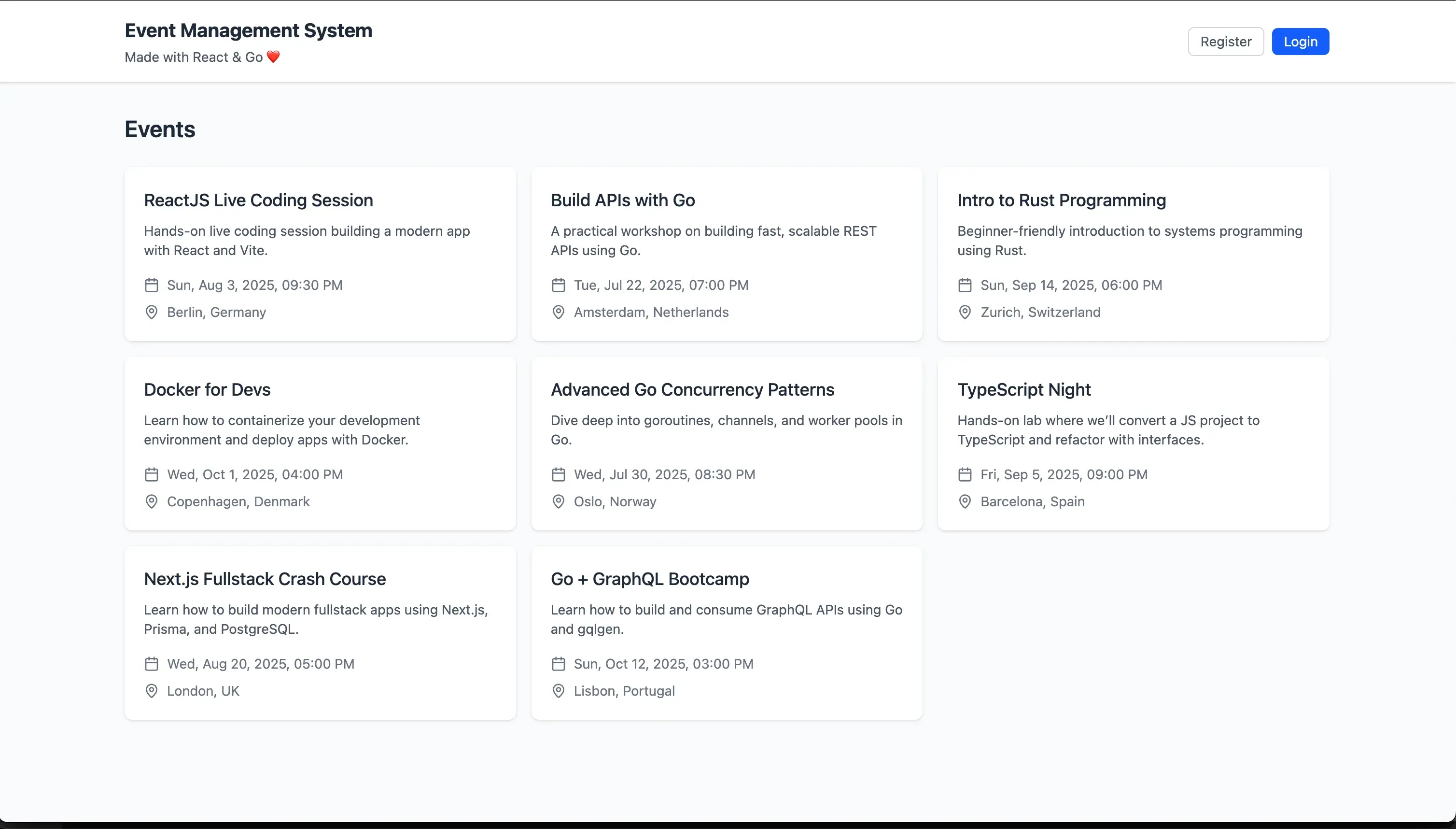
📄 Creating the Events Page
Creating the EventsPage component
When the user visits the events page we want to fetch the events from the API and display them.
Open the file:
src/pages/EventsPage.tsx
Remove all the code and add the following:
import { fetchEvents } from "../api/events";
import { EventList } from "../components/events/EventList";
import type { EventData } from "../types";
import { useFetch } from "../hooks/useFetch";

export function EventsPage() {
  const { data, loading, error } = useFetch<EventData[]>(fetchEvents);
  const events = data ?? [];

  return (
    <>
      <div className="mb-6 flex items-center justify-between">
        <h1 className="text-2xl font-semibold text-gray-800">Events</h1>
      </div>

      <EventList
        loading={loading}
        error={error?.message ?? null}
        events={events}
      />
    </>
  );
}
We are using the useFetch hook to fetch the events from the API, this hook is a custom hook that we will create in the next section. We pass the data to the EventList component. This component will also be used in the my events page.
Createting the useFetch hook & fetchEvents api call
Create a new file:
src/hooks/useFetch.tsx
Add the following code:
import { useState, useEffect, useCallback } from "react";

type UseFetchResult<T> = {
  data: T | null;
  error: Error | null;
  loading: boolean;
  refetch: () => void;
};

export function useFetch<T>(fetcher: () => Promise<T>): UseFetchResult<T> {
  const [data, setData] = useState<T | null>(null);
  const [error, setError] = useState<Error | null>(null);
  const [loading, setLoading] = useState<boolean>(false);

  const fetchData = useCallback(async () => {
    setLoading(true);
    setError(null);
    try {
      const result = await fetcher();
      setData(result);
    } catch (err) {
      setError(err as Error);
    } finally {
      setLoading(false);
    }
  }, [fetcher]);

  useEffect(() => {
    fetchData();
  }, [fetchData]);

  return { data, error, loading, refetch: fetchData };
}
The useFetch hook is a custom hook that fetches data from the API and returns the data, error, loading state and a function to refetch the data. The purpose of this hook is to avoid repeating the same code in every page that fetches data from the API.
If you would use a library like react-query, under the hood it would be doing something similar to this.
Now we need to create the fetchEvents api call.
Inside the src/api folder, create a new file:
src/api/events.ts
With the following code:
import type { EventData } from "../types";
import { API_BASE_URL, apiFetch } from "./api";

export const fetchEvents = async (): Promise<EventData[]> => {
  try {
    const response = await apiFetch(`${API_BASE_URL}/v1/events`);

    if (!response.ok) {
      throw new Error(`API error: ${response.status}`);
    }

    return await response.json();
  } catch (error) {
    console.error("Error fetching events:", error);
    throw error;
  }
};
We are using the helpers we created earlier and then we are making a GET request to the /v1/events endpoint.
If the request is successful, we will receive an array of events in the response. If the request fails, we will throw an error.
Creating the types for the events
Inside the src/types.ts file, add the following code:
export interface EventData {
  id: number;
  name: string;
  description: string;
  date: string;
  location: string;
  ownerId: number;
}
This is the type for the events that we will get back from the API.
If we now go to the events page it should say no events found. This is because we don’t have any events in the database.
Creating the EventList component
Inside the src/components folder create a new folder called events and inside it create a new file called EventList.tsx
Add the following code:
import { useNavigate } from "react-router-dom";
import { EventCard } from "./EventCard";
import type { Event } from "../../types";
import { LoadingMessage } from "../LoadingMessage";
import { ErrorMessage } from "../ErrorMessage";

interface EventListProps {
  events: EventData[];
  loading: boolean;
  error: string | null;
}

export function EventList({
  events,
  loading = false,
  error = null,
}: EventListProps) {
  const navigate = useNavigate();
  const handleEventClick = (eventId: number) => navigate(`/events/${eventId}`);

  if (loading) return <LoadingMessage message="Loading events..." />;

  if (error) return <ErrorMessage error={error} />;

  if (events.length === 0)
    return (
      <div className="rounded-lg bg-white p-6 text-center text-gray-500 shadow">
        No events found.
      </div>
    );

  return (
    <div className="grid grid-cols-1 gap-4 md:grid-cols-2 lg:grid-cols-3">
      {events.map(event => (
        <EventCard key={event.id} event={event} onClick={handleEventClick} />
      ))}
    </div>
  );
}
We start by defining the props that the component will receive. It will receive the events, loading state and error state.
We check if the loading state is true in that case we return a loading message. We do the same for the error state.
If the events array is empty we return a message saying no events found.
If we have a array of events we map over them and return an EventCard component for each event. We pass the event to the EventCard component and the onEventClick function so we can navigate to the event details page when the user clicks on an event.
Creating the EventCard component
Create a new file:
src/components/events/EventCard.tsx
With this code:
import { formatDate } from "../../utils/dateUtils";
import { MapPinIcon, CalendarIcon } from "lucide-react";
import type { EventData } from "../../types";

interface EventCardProps {
  event: EventData;
  onClick: (eventId: number) => void;
}

export function EventCard({ event, onClick }: EventCardProps) {
  return (
    <div
      className="flex h-full cursor-pointer flex-col overflow-hidden rounded-lg bg-white shadow transition-shadow duration-300 hover:shadow-md"
      onClick={() => onClick(event.id)}
    >
      <div className="flex flex-1 flex-col p-5">
        <h3 className="mb-2 text-lg font-medium text-gray-800">{event.name}</h3>

        <p className="mb-4 line-clamp-2 text-sm text-gray-600">
          {event.description}
        </p>

        <div className="mb-2 flex items-center text-sm text-gray-500">
          <CalendarIcon className="mr-2 h-4 w-4" />
          <p>{formatDate(event.date)}</p>
        </div>

        <div className="flex items-center text-sm text-gray-500">
          <MapPinIcon className="mr-2 h-4 w-4" />
          <p>{event.location}</p>
        </div>
      </div>
    </div>
  );
}
We use tailwind to style the component to make it look nice. We then display the details of the event. To show some icons we use the lucide-react library. When the user clicks on the event card we navigate to the event details page. Since the date is not really human readable we use a helper function to format it.
Inside the src/utils folder create a new file called dateUtils.ts with the following code:
export const formatDate = (dateString: string): string => {
  const date = new Date(dateString);

  if (isNaN(date.getTime())) {
    return "Invalid date format";
  }

  return date.toLocaleDateString(navigator.language, {
    weekday: "short",
    year: "numeric",
    month: "short",
    day: "numeric",
    hour: "2-digit",
    minute: "2-digit",
  });
};
We parse the date string to a date object if it is not a valid date we return a message saying invalid date format. Otherwise we return the date in a human readable format.
📄 Showing my events data
Since we are using the same EventList component in the my events page we can reuse it.
Update the src/pages/MyEventsPage.tsx file to the following:
import { fetchUserEvents } from "../api/attendees";
import { useAuth } from "../contexts/AuthContext";
import type { EventData } from "../types";
import { EventList } from "../components/events/EventList";
import { useFetch } from "../hooks/useFetch";
import { useCallback } from "react";

export function MyEventsPage() {
  const { auth } = useAuth();
  const getUserEvents = useCallback(
    () => fetchUserEvents(auth?.userId),
    [auth]
  );

  const { data: events, loading, error } = useFetch<EventData[]>(getUserEvents);

  return (
    <div>
      <h1 className="mb-6 text-2xl font-semibold text-gray-800">
        Events I'm Attending
      </h1>
      <EventList
        loading={loading}
        error={error?.message ?? null}
        events={events || []}
      />
    </div>
  );
}
This page is very similar to the events page. We are using the same EventList component and the same useFetch hook but with a different api call.
To fetch the events the user is attending we first need to get the user id from the auth context. We then pass the user id to the fetchUserEvents api call.
We wrap the getUserEvents function with useCallback to prevent it from being recreated on every render. useCallback is a React hook that remembers a function between renders, only creating a new version when its dependencies change. Without this, the function would change every time the component re-renders, which would trigger our useFetch hook to run again, creating an endless loop of API calls.
All we need to do now is to create the fetchUserEvents api call. Inside the src/api folder create a new file called attendees.ts with the following code:
import type { EventData } from "../types";
import { API_BASE_URL, apiFetch } from "./api";

export const fetchUserEvents = async (
  userId: number | undefined
): Promise<EventData[]> => {
  if (!userId) {
    return [];
  }

  try {
    const response = await apiFetch(
      `${API_BASE_URL}/v1/attendees/${userId}/events`
    );

    if (!response.ok) {
      throw new Error(`API error: ${response.status}`);
    }

    return await response.json();
  } catch (error) {
    console.error(`Error fetching events for user ${userId}:`, error);
    throw error;
  }
};
We are making a GET request to the /v1/attendees/${userId}/events endpoint and we are passing the user id to the endpoint.
If we now go to the my events page you should see a message saying no events found. This is because we are not attending any events yet. We will add the ability for a event owner to add attendees to their event later.
Creating events
Inside the events page we want to add a button to create a new event.
Update the EventsPage component to add a button to create a new event.
import { useState } from "react";
import { fetchEvents } from "../api/events";
import { EventList } from "../components/events/EventList";
import { AddEventModal } from "../components/events/AddEventModal";
import { useAuth } from "../contexts/AuthContext";
import type { EventData } from "../types";
import { Button } from "../components/Button";
import { PlusIcon } from "lucide-react";
import { useFetch } from "../hooks/useFetch";

export function EventsPage() {
  const { isAuthenticated } = useAuth();
  const [isAddEventModalOpen, setIsAddEventModalOpen] = useState(false);
  const { data, loading, error, refetch } = useFetch<EventData[]>(fetchEvents);
  const events = data ?? [];

  const handleAddEvent = () => {
    refetch();
    setIsAddEventModalOpen(false);
  };

  return (
    <>
      <div className="mb-6 flex items-center justify-between">
        <h1 className="text-2xl font-semibold text-gray-800">Events</h1>
        <div className="flex items-center space-x-4">
          {isAuthenticated && (
            <Button
              icon={<PlusIcon className="mr-1 h-4 w-4" />}
              onClick={() => setIsAddEventModalOpen(true)}
            >
              Add Event
            </Button>
          )}
        </div>
      </div>

      <EventList
        loading={loading}
        error={error?.message ?? null}
        events={events}
      />

      {isAddEventModalOpen && isAuthenticated && (
        <AddEventModal
          isOpen={isAddEventModalOpen}
          onClose={() => setIsAddEventModalOpen(false)}
          onAddEvent={handleAddEvent}
        />
      )}
    </>
  );
}
We create a state to keep track of the add event modal open state. This modal will contain a form to create a new event.
Next we have a button to open the modal. When the user clicks the button we set the isAddEventModalOpen state to true. This button is only visible if the user is authenticated.
Next we have the AddEventModal component. This component is a modal that will contain a form to create a new event.
Let’s create the AddEventModal component.
Create a new file:
src/components/events/AddEventModal.tsx
Add the following code:
import { XIcon } from "lucide-react";
import { createEvent } from "../../api/events";
import type { EventData } from "../../types";
import { InputGroup } from "../InputGroup";
import { Button } from "../Button";
import { useForm } from "../../hooks/useForm";

interface AddEventModalProps {
  isOpen: boolean;
  onClose: () => void;
  onAddEvent: (event: EventData) => void;
}

interface EventFormData {
  name: string;
  description: string;
  date: string;
  location: string;
}

const initialValues: EventFormData = {
  name: "",
  description: "",
  date: "",
  location: "",
};

export function AddEventModal({
  isOpen,
  onClose,
  onAddEvent,
}: AddEventModalProps) {
  const validate = (values: EventFormData) => {
    const errors: Partial<EventFormData> = {};
    if (values.name.length < 3)
      errors.name = "Name must be at least 3 characters";
    if (values.description.length < 10)
      errors.description = "Description must be at least 10 characters";
    if (!values.date.length) errors.date = "Date is required";
    if (values.location.length < 3)
      errors.location = "Location must be at least 3 characters";
    console.log("errors", errors);
    return errors;
  };

  const onSubmit = async (values: EventFormData) => {
    const date = new Date(values.date);
    const formattedValues = {
      ...values,
      date: date.toISOString(),
    };
    const newEvent = await createEvent(formattedValues);
    onAddEvent(newEvent);
    reset();
    onClose();
  };

  const { values, errors, isLoading, handleChange, handleSubmit, reset } =
    useForm({
      initialValues,
      validate,
      onSubmit,
    });

  if (!isOpen) return null;

  return (
    <div
      className="fixed inset-0 z-50 flex items-center justify-center bg-gray-900/60 p-4"
      onClick={onClose}
    >
      <div
        className="w-full max-w-md rounded-lg bg-white shadow-lg"
        onClick={e => e.stopPropagation()}
      >
        <div className="flex items-center justify-between border-b border-gray-200 p-4">
          <h2 className="text-lg font-semibold text-gray-800">Add New Event</h2>

          <Button variant="secondary" onClick={onClose}>
            <XIcon className="h-5 w-5" />
          </Button>
        </div>

        <form onSubmit={handleSubmit} className="p-4">
          <div className="space-y-4">
            <InputGroup
              name="name"
              label="Name"
              value={values.name}
              onChange={handleChange}
              error={errors.name}
            />

            <InputGroup
              name="description"
              label="Description"
              value={values.description}
              onChange={handleChange}
              error={errors.description}
              isTextArea
            />

            <InputGroup
              name="date"
              type="datetime-local"
              label="Date and Time"
              value={values.date}
              onChange={handleChange}
              error={errors.date}
            />

            <InputGroup
              name="location"
              label="Location"
              value={values.location}
              onChange={handleChange}
              error={errors.location}
            />
          </div>

          <div className="mt-6 flex justify-end space-x-2">
            <Button variant="secondary" onClick={onClose}>
              Cancel
            </Button>
            <Button type="submit" disabled={isLoading}>
              {isLoading ? "Creating..." : "Create Event"}
            </Button>
          </div>
        </form>
      </div>
    </div>
  );
}
We start by creating some interfaces for the form data and the props that the component will receive. We also create an initial values object for the form data.
To validate the form data we create a validate function. We check length of the input fields and make sure the date is not empty.
Then we have the onSubmit function. This function is called when the user submits the form. We parse the date to a ISO string and then we call the createEvent api call, then we reset the form and close the modal.
After that we use the useForm hook to handle the form data and validation. We pass the initial values, validate function and onSubmit function. We destructure the values, errors, isLoading, handleChange, handleSubmit and reset from the hook.
If the modal is not open we just return null.
We have our modal container. It dims the background and centers the modal. We also stop the event from bubbling up to the parent container. This is because we want to close the modal when the user clicks outside of it however we want to keep the modal open when the user clicks submit and the form has errors.
After that we use the input group component to create the form fields. We pass the state from the useForm hook to the inputs. Then we have a submit & cancel button.
Lets add the api call to create a new event. Inside the src/api/events.ts file add the following code:
export const createEvent = async (
  event: Omit<EventData, "id" | "ownerId">
): Promise<EventData> => {
  try {
    const response = await apiFetch(`${API_BASE_URL}/v1/events`, {
      method: "POST",
      body: JSON.stringify(event),
    });

    if (!response.ok) {
      throw new Error(`API error: ${response.status}`);
    }

    return await response.json();
  } catch (error) {
    console.error("Error creating event:", error);
    throw error;
  }
};
Here we are using the Omit type to omit the id and ownerId properties from the event object. We are not sending these properties to the API. We do post the event object to the API and the API will return the created event with the id and ownerId.
We can now go to the events page and click the add event button. We should see a modal to create a new event.
If we fill out the form and click create event we should see the new event in the events list.
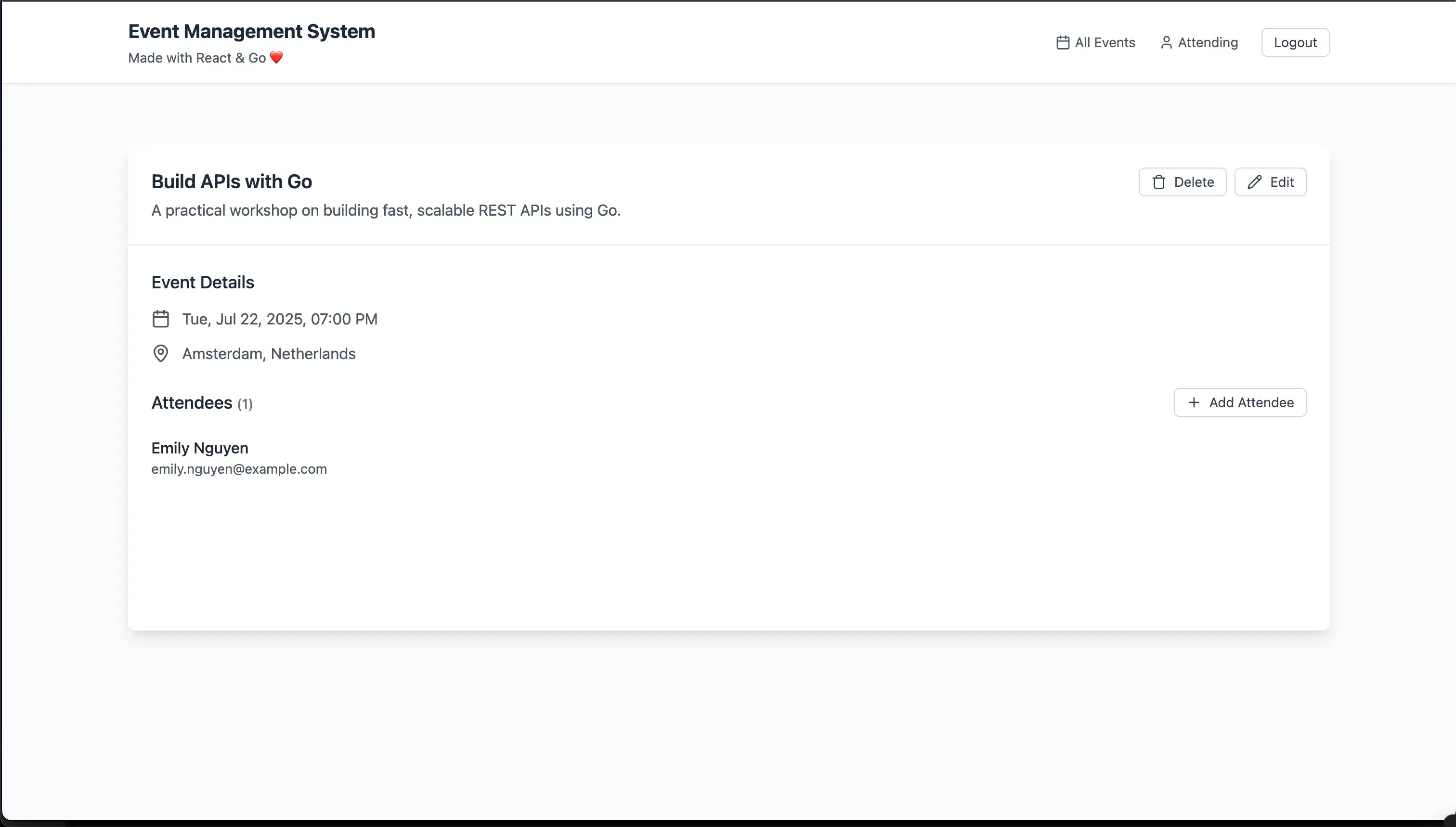
📄 Showing event details
When we click on an event card we want to see the details of the event.
Open the file:
src/pages/EventDetailsPage.tsx
Remove all the code and add the following:
import { useCallback } from "react";
import {
  fetchEventAttendees,
  removeAttendeeFromEvent,
  addAttendeeToEvent,
} from "../api/attendees";
import { deleteEvent, fetchEventById } from "../api/events";
import { fetchUsers } from "../api/users";
import { useAuth } from "../contexts/AuthContext";
import type { EventData, User } from "../types";
import { useParams, useNavigate } from "react-router-dom";
import { AddAttendeeModal } from "../components/attendees/AddAttendeeModal";
import { CalendarIcon, MapPinIcon, PencilIcon, TrashIcon } from "lucide-react";
import { formatDate } from "../utils/dateUtils";
import { LoadingMessage } from "../components/LoadingMessage";
import { AttendeeSection } from "../components/attendees/AttendeeSection";
import { Button } from "../components/Button";
import { useFetch } from "../hooks/useFetch";
import { useState } from "react";
import { ErrorMessage } from "../components/ErrorMessage";
import { useAsync } from "../hooks/useAsync";
import { ConfirmModal } from "../components/ConfirmModal";

export function EventDetailsPage() {
  const { auth } = useAuth();
  const { eventId } = useParams();
  const navigate = useNavigate();
  const [isAddAttendeeModalOpen, setIsAddAttendeeModalOpen] = useState(false);
  const [isDeleteConfirmModalOpen, setIsDeleteConfirmModalOpen] =
    useState(false);

  const getEvent = useCallback(
    () => fetchEventById(Number(eventId)),
    [eventId]
  );

  const getAttendees = useCallback(
    () => fetchEventAttendees(Number(eventId)),
    [eventId]
  );

  const {
    data: currentEvent,
    loading: eventLoading,
    error: eventError,
  } = useFetch<EventData>(getEvent);

  const {
    data: attendees,
    refetch: refetchAttendees,
    error: attendeesError,
  } = useFetch<User[]>(getAttendees);

  const getUsersIfAuthenticated = useCallback(
    () => (auth ? fetchUsers() : Promise.resolve([])),
    [auth]
  );

  const {
    data: users,
    loading: usersLoading,
    error: usersError,
  } = useFetch<User[]>(getUsersIfAuthenticated);

  const { run: deleteEventAction, error: deleteEventError } = useAsync({
    action: deleteEvent,
    onSuccess: () => navigate("/events"),
    errorMessage: "Failed to delete event",
  });

  const { run: removeAttendeeAction, error: removeError } = useAsync({
    action: removeAttendeeFromEvent,
    onSuccess: refetchAttendees,
    errorMessage: "Failed to remove attendee",
  });

  const { run: addAttendeeAction, error: addError } = useAsync({
    action: addAttendeeToEvent,
    onSuccess: refetchAttendees,
    errorMessage: "Failed to add attendee",
  });

  const error =
    eventError ||
    attendeesError ||
    usersError ||
    removeError ||
    addError ||
    deleteEventError;

  if (eventLoading) {
    return <LoadingMessage message="Loading..." />;
  }

  const currentAttendees = attendees || [];

  return (
    <div className="mx-auto my-8 flex w-full flex-col overflow-hidden rounded-lg bg-white shadow-lg ">
      {error && <ErrorMessage error={error} />}
      <div className="flex flex-col-reverse gap-4 border-b border-gray-200 p-6 md:flex-row md:items-start md:justify-between">
        <div className="min-w-0 flex-1">
          <h2 className="max-w-xl break-words text-xl font-semibold text-gray-800">
            {currentEvent?.name}
          </h2>
          <p className="mt-1 max-w-xl whitespace-pre-wrap break-words text-gray-600">
            {currentEvent?.description}
          </p>
        </div>
        {auth?.userId === currentEvent?.ownerId && (
          <div className="mb-4 flex flex-shrink-0 gap-2 md:mb-0">
            <Button
              size="small"
              variant="secondary"
              icon={<TrashIcon className="h-4 w-4" />}
              onClick={() => setIsDeleteConfirmModalOpen(true)}
            >
              Delete
            </Button>
            <Button
              size="small"
              variant="secondary"
              icon={<PencilIcon className="h-4 w-4" />}
              onClick={() => navigate(`/events/${eventId}/edit`)}
            >
              Edit
            </Button>
          </div>
        )}
      </div>

      <div className="min-h-[400px] flex-1 p-6">
        <div className="mb-6">
          <h3 className="mb-3 text-lg font-medium text-gray-800">
            Event Details
          </h3>
          <div className="space-y-3">
            <div className="flex items-center text-gray-600">
              <CalendarIcon className="mr-3 h-5 w-5" />
              <span>{formatDate(currentEvent?.date || "")}</span>
            </div>
            <div className="flex items-center text-gray-600">
              <MapPinIcon className="mr-3 h-5 w-5" />
              <span>{currentEvent?.location}</span>
            </div>
          </div>
        </div>

        <AttendeeSection
          attendees={currentAttendees}
          isOwner={auth?.userId === currentEvent?.ownerId}
          setIsAddAttendeeModalOpen={setIsAddAttendeeModalOpen}
          handleRemoveAttendee={attendeeId =>
            removeAttendeeAction(attendeeId, Number(eventId))
          }
        />
      </div>

      <AddAttendeeModal
        isOpen={isAddAttendeeModalOpen}
        isLoading={usersLoading}
        eventId={currentEvent?.id || 0}
        existingAttendees={currentAttendees}
        users={users || []}
        onClose={() => setIsAddAttendeeModalOpen(false)}
        onAdd={userId => addAttendeeAction(Number(eventId), userId)}
      />

      <ConfirmModal
        isOpen={isDeleteConfirmModalOpen}
        title="Delete Event"
        description={`Are you sure you want to delete "${currentEvent?.name}"?`}
        confirmButtonText="Delete"
        onConfirm={() => deleteEventAction(Number(eventId))}
        onClose={() => setIsDeleteConfirmModalOpen(false)}
      />
    </div>
  );
}
This is probably the most complex page in our app. The reason for this is that we are fetching multiple pieces of data from the API. We are fetching the event details, the attendees, the users and we also have api calls to add and remove attendees. However the code should still be readable and hopefully not to hard to understand.
After we setup all the api calls with our custom hooks We display the details of the event. We also display the all the attendees for this event. Then we have buttons to edit and delete the event. We also have two modals one for adding attendees and one for confirming the delete event action.
useAsync hook and api calls
To handle api calls that triggers an action but don’t use a full form we are gonna create a custom hook. To reduce code duplication.
Inside the src/hooks folder create a new file called useAsync.ts with the following code:
import { useState } from "react";

export function useAsync<Data, Params extends unknown[]>(config: {
  action: (...params: Params) => Promise<Data>;
  onSuccess?: () => void;
  errorMessage?: string;
}) {
  const [error, setError] = useState<Error | null>(null);

  const run = async (...params: Params) => {
    try {
      setError(null);
      await config.action(...params);
      if (config.onSuccess) {
        await config.onSuccess();
      }
    } catch (err) {
      setError(
        err instanceof Error
          ? err
          : new Error(config.errorMessage ?? "Operation failed")
      );
    }
  };

  return { run, error, setError };
}
This will call the api call and handle the error. We can also call a function after the api call is successful.
Now we have 6 new api calls we need to create.
- fetchEventAttendees
- removeAttendeeFromEvent
- addAttendeeToEvent
- deleteEvent
- fetchEventById
- fetchUsers
Inside the src/api/attendees.ts file add the following code:
export const fetchEventAttendees = async (eventId: number): Promise<User[]> => {
  try {
    const response = await apiFetch(
      `${API_BASE_URL}/v1/events/${eventId}/attendees`
    );

    if (!response.ok) {
      throw new Error(`API error: ${response.status}`);
    }

    return await response.json();
  } catch (error) {
    console.error(`Error fetching attendees for event ${eventId}:`, error);
    throw error;
  }
};

export const addAttendeeToEvent = async (
  eventId: number,
  userId: number
): Promise<void> => {
  try {
    const response = await apiFetch(
      `${API_BASE_URL}/v1/events/${eventId}/attendees/${userId}`,
      {
        method: "POST",
      }
    );

    if (!response.ok) {
      throw new Error(`API error: ${response.status}`);
    }
  } catch (error) {
    console.error(
      `Error adding attendee ${userId} to event ${eventId}:`,
      error
    );
    throw error;
  }
};

export const removeAttendeeFromEvent = async (
  attendeeId: number,
  eventId: number
): Promise<void> => {
  try {
    const response = await apiFetch(
      `${API_BASE_URL}/v1/events/${eventId}/attendees/${attendeeId}`,
      {
        method: "DELETE",
      }
    );

    if (!response.ok) {
      throw new Error(`API error: ${response.status}`);
    }
  } catch (error) {
    console.error(
      `Error removing attendee ${attendeeId} from event ${eventId}:`,
      error
    );
    throw error;
  }
};
Don’t forget to add the import for the User type.
import type { User } from "../types";These api calls are very similar to previous api calls we have created. With the only diffrence the data we pass and the api endpoints.
Let’s now create deleteEvent & fetchEventById.
Inside the src/api/events.ts file add the following code:
export const deleteEvent = async (eventId: number): Promise<void> => {
  try {
    const response = await apiFetch(`${API_BASE_URL}/v1/events/${eventId}`, {
      method: "DELETE",
    });

    if (!response.ok) {
      throw new Error(`API error: ${response.status}`);
    }
  } catch (error) {
    console.error(`Error deleting event ${eventId}:`, error);
    throw error;
  }
};

export const fetchEventById = async (eventId: number): Promise<EventData> => {
  try {
    const response = await apiFetch(`${API_BASE_URL}/v1/events/${eventId}`);
    if (!response.ok) {
      throw new Error(`API error: ${response.status}`);
    }
    return await response.json();
  } catch (error) {
    console.error(`Error fetching event ${eventId}:`, error);
    throw error;
  }
};
Now we only have fetchUsers left to create.
Create a new file:
src/api/users.ts
Add the following code:
import type { User } from "../types";
import { API_BASE_URL, apiFetch } from "./api";

export const fetchUsers = async (): Promise<User[]> => {
  try {
    const response = await apiFetch(`${API_BASE_URL}/v1/users`);

    if (!response.ok) {
      throw new Error(`API error: ${response.status}`);
    }

    return await response.json();
  } catch (error) {
    console.error("Error fetching users:", error);
    throw error;
  }
};
Attendee section
When viewing an event we want to show the attendees for that event. Start by creating a new folder in the src/components folder called Attendees.
Inside the Attendees folder create a new file called AttendeeSection.tsx
Add the following code:
import type { User } from "../../types";
import { AttendeeHeader } from "./AttendeeHeader";
import { AttendeeList } from "./AttendeeList";

export function AttendeeSection({
  attendees,
  isOwner,
  setIsAddAttendeeModalOpen,
  handleRemoveAttendee,
}: {
  attendees: User[];
  isOwner: boolean;
  setIsAddAttendeeModalOpen: (isOpen: boolean) => void;
  handleRemoveAttendee: (id: number) => void;
}) {
  return (
    <div>
      <AttendeeHeader
        attendees={attendees}
        isOwner={isOwner}
        setIsAddAttendeeModalOpen={setIsAddAttendeeModalOpen}
      />
      <AttendeeList
        attendees={attendees}
        isOwner={isOwner}
        onRemoveAttendee={handleRemoveAttendee}
      />
    </div>
  );
}
This component is a container for the attendee header and list. We pass the attendees, isOwner, setIsAddAttendeeModalOpen and handleRemoveAttendee to the component.
Attendee header
In this componenet we will display the number of attendees and the button to add an attendee.
Create a new file:
src/components/Attendees/AttendeeHeader.tsx
Add the following code:
import { PlusIcon } from "lucide-react";
import type { User } from "../../types";
import { Button } from "../Button";

interface AttendeeHeaderProps {
  attendees: User[];
  isOwner: boolean;
  setIsAddAttendeeModalOpen: (isOpen: boolean) => void;
}

export function AttendeeHeader({
  attendees,
  isOwner,
  setIsAddAttendeeModalOpen,
}: AttendeeHeaderProps) {
  return (
    <div className="mb-1 flex items-center justify-between">
      <h3 className="text-lg font-medium text-gray-800">
        {attendees.length > 0 ? "Attendees" : "No attendees yet"}{" "}
        <span className="text-sm text-gray-500">({attendees.length})</span>
      </h3>
      {isOwner && (
        <Button
          variant="secondary"
          size="small"
          icon={<PlusIcon className="h-4 w-4" />}
          onClick={() => setIsAddAttendeeModalOpen(true)}
        >
          Add Attendee
        </Button>
      )}
    </div>
  );
}
We display the number of attendees and the button to add an attendee. If the user is the owner of the event we show the button to add an attendee.
Attendee list
Create a new file:
src/components/Attendees/AttendeeList.tsx
Add the following code:
import type { User } from "../../types";
import { XIcon, CheckIcon } from "lucide-react";
import { Button } from "../Button";
import clsx from "clsx";

interface AttendeeListProps {
  attendees: User[];
  mode?: "display" | "selection";
  isOwner?: boolean;
  selectedAttendee?: User | null;
  onAttendeeSelect?: (attendee: User) => void;
  onRemoveAttendee?: (id: number) => void;
}

export function AttendeeList({
  attendees = [],
  mode = "display",
  isOwner,
  selectedAttendee,
  onAttendeeSelect = () => {},
  onRemoveAttendee = () => {},
}: AttendeeListProps) {
  if (attendees.length === 0) return null;

  return (
    <div>
      <ul className="h-full divide-y divide-gray-200 pb-6">
        {attendees.map(({ id, name, email }) => (
          <li
            key={id}
            className={clsx(
              "group flex items-center justify-between py-4 hover:bg-gray-50",
              mode === "selection" && {
                "cursor-pointer": true,
                "bg-blue-50": selectedAttendee?.id === id,
              }
            )}
            onClick={() =>
              mode === "selection" && onAttendeeSelect({ id, name, email })
            }
          >
            <div>
              <p className="font-medium text-gray-800">{name}</p>
              <p className="text-sm text-gray-600">{email}</p>
            </div>
            {mode === "display" && isOwner && onRemoveAttendee && (
              <Button
                size="small"
                className="mr-4 cursor-pointer rounded-full p-1.5 opacity-0 hover:bg-red-50 group-hover:opacity-100"
                onClick={() => onRemoveAttendee(id)}
                variant="secondary"
              >
                <XIcon className="h-5 w-5 text-gray-400 hover:text-red-500" />
              </Button>
            )}
            {mode === "selection" && selectedAttendee?.id === id && (
              <CheckIcon className="mr-4 h-5 w-5 text-blue-600" />
            )}
          </li>
        ))}
      </ul>
    </div>
  );
}
This component is a list of attendees. We display the name and email of the attendee. If the user is the owner of the event we show a button to remove the attendee. If the user is in selection mode we show a check icon if the attendee is selected. This is because we will use this component in the add attendee modal.
Add attendee modal
When clicking the add attendee button we want to show a modal with a list of users. It shoulder be possible to search for a user. We also only want to show users that are not already attending the event.
Let’s start with the search bar.
This will be used to filter the users.
Create a new file:
src/components/SearchBar.tsx
Add the following code:
import { SearchIcon } from "lucide-react";
import type { ChangeEventHandler } from "react";

export function SearchBar({
  value,
  onChange,
}: {
  value: string;
  onChange: ChangeEventHandler<HTMLInputElement>;
}) {
  return (
    <div className="border-b border-gray-200 py-4">
      <div className="relative">
        <div className="pointer-events-none absolute inset-y-0 left-0 flex items-center pl-3">
          <SearchIcon className="h-4 w-4 text-gray-400" />
        </div>
        <input
          type="text"
          placeholder="Search users..."
          className="w-full rounded-md border border-gray-300 py-2 pl-10 pr-4 focus:outline-none focus:ring-2 focus:ring-blue-500"
          value={value}
          onChange={onChange}
        />
      </div>
    </div>
  );
}
It’s a simple input component with a search icon. It takes 2 props value and onChange.
Now we need to create the modal that will be used to add an attendee.
Create a new file:
src/components/Attendees/AddAttendeeModal.tsx
This modal component allows event owners to add new attendees to their events. It includes several key features:
Add the following code:
import { useState } from "react";
import { XIcon } from "lucide-react";
import type { User } from "../../types";
import { LoadingMessage } from "../LoadingMessage";
import { Button } from "../Button";
import { SearchBar } from "../SearchBar";
import { AttendeeList } from "./AttendeeList";

interface AddAttendeeModalProps {
  isOpen: boolean;
  onClose: () => void;
  eventId: number;
  existingAttendees: User[];
  users: User[];
  isLoading: boolean;
  onAdd: (userId: number) => Promise<void>;
}

export function AddAttendeeModal({
  isOpen,
  onClose,
  existingAttendees,
  users,
  isLoading,
  onAdd,
}: AddAttendeeModalProps) {
  const [searchTerm, setSearchTerm] = useState("");
  const [selectedUser, setSelectedUser] = useState<User | null>(null);
  const [isAdding, setIsAdding] = useState(false);

  const availableUsers = users.filter(
    user => !existingAttendees.some(attendee => attendee.id === user.id)
  );

  const filteredUsers =
    searchTerm.trim() === ""
      ? availableUsers
      : availableUsers.filter(
          user =>
            user.name.toLowerCase().includes(searchTerm.toLowerCase()) ||
            user.email.toLowerCase().includes(searchTerm.toLowerCase())
        );

  const handleAddAttendee = async (userToAdd: User) => {
    try {
      setIsAdding(true);
      await onAdd(userToAdd.id);
    } finally {
      setIsAdding(false);
    }
  };

  const handleClose = () => {
    setSearchTerm("");
    setSelectedUser(null);
    onClose();
  };

  if (!isOpen) return null;

  return (
    <div
      className="fixed inset-0 z-50 flex items-center justify-center bg-gray-900/60 p-4"
      onClick={onClose}
    >
      <div
        className="flex h-full max-h-[90vh] w-full max-w-xl flex-col overflow-hidden rounded-lg bg-white p-4 shadow-lg"
        onClick={e => e.stopPropagation()}
      >
        <div className="flex items-center justify-between border-b border-gray-200 py-4">
          <h2 className="text-lg font-semibold text-gray-800">Add Attendee</h2>
          <Button size="small" variant="secondary" onClick={onClose}>
            <XIcon className="h-5 w-5" />
          </Button>
        </div>

        <SearchBar
          value={searchTerm}
          onChange={e => setSearchTerm(e.target.value)}
        />

        <div className="flex-1 overflow-y-auto p-1">
          {isLoading ? (
            <LoadingMessage message="Loading..." />
          ) : (
            <AttendeeList
              attendees={filteredUsers}
              mode="selection"
              selectedAttendee={selectedUser}
              onAttendeeSelect={setSelectedUser}
            />
          )}
        </div>

        <div className="flex justify-end space-x-2 border-t border-gray-200 p-4">
          <Button variant="secondary" onClick={handleClose}>
            Cancel
          </Button>
          <Button
            onClick={() => selectedUser && handleAddAttendee(selectedUser)}
            disabled={!selectedUser || isAdding}
          >
            {isAdding ? "Adding..." : "Add"}
          </Button>
        </div>
      </div>
    </div>
  );
}- User Filtering: Only shows users who aren’t already attending the event
- Search Functionality: Users can search by name or email to quickly find people
- Selection Mode: Users can select someone from the list before adding them
- Loading States: Shows loading indicators during API calls
The component manages local state for the search term, selected user, and loading states. It filters the available users based on existing attendees and the search input, making it easy to find and add new people to events.
Confirm delete event modal
When deleting an event we want to show a modal to confirm the action.
Create a new file:
src/components/ConfirmModal.tsx
Add the following code:
import { Button } from "./Button";

interface ConfirmModalProps {
  isOpen: boolean;
  title: string;
  description: string;
  confirmButtonText: string;
  cancelButtonText?: string;
  onConfirm: () => void;
  onClose: () => void;
}

export function ConfirmModal({
  isOpen,
  title,
  description,
  confirmButtonText,
  cancelButtonText = "Cancel",
  onConfirm,
  onClose,
}: ConfirmModalProps) {
  if (!isOpen) return null;

  return (
    <div
      className="fixed inset-0 z-50 flex items-center justify-center bg-gray-900/60 p-4"
      onClick={onClose}
    >
      <div
        className="w-full max-w-md rounded-lg bg-white shadow-lg"
        onClick={e => e.stopPropagation()}
      >
        <div className="flex items-center justify-between border-b border-gray-200 p-4">
          <h2 className="text-lg font-semibold text-gray-800">{title}</h2>
        </div>

        <div className="p-4">
          <p className="mb-6 text-gray-600">{description}</p>
          <div className="flex justify-end space-x-2">
            <Button variant="secondary" onClick={onClose}>
              {cancelButtonText}
            </Button>
            <Button
              variant="primary"
              onClick={() => {
                onConfirm();
                onClose();
              }}
            >
              {confirmButtonText}
            </Button>
          </div>
        </div>
      </div>
    </div>
  );
}
This is a simple modal component with a title, description, confirm button and cancel button.
You show now be able to see the details of the event. Add & remove attendees if you are the owner of the event and delete the event.
Edit event page
The last page we need to create is the edit event page. This page allows event owners to modify their existing events.
Create a new file:
src/pages/EditEventPage.tsx
Add the following code:
import { useForm } from "../hooks/useForm";
import { CheckIcon } from "lucide-react";
import { InputGroup } from "../components/InputGroup";
import { Button } from "../components/Button";
import { formatDateForInput } from "../utils/dateUtils";
import { useNavigate, useParams } from "react-router-dom";
import { fetchEventById, updateEvent } from "../api/events";
import { useFetch } from "../hooks/useFetch";
import type { EventData } from "../types";
import { useCallback, useState, useMemo } from "react";
import { LoadingMessage } from "../components/LoadingMessage";
import { ErrorMessage } from "../components/ErrorMessage";

export function EditEventPage() {
  const { eventId } = useParams();
  const [isSubmitting, setIsSubmitting] = useState(false);
  const navigate = useNavigate();

  const getEvent = useCallback(
    () => fetchEventById(Number(eventId)),
    [eventId]
  );

  const {
    data: currentEvent,
    loading: isLoading,
    error,
  } = useFetch<EventData>(getEvent);

  const initialValues = useMemo(
    () => ({
      name: currentEvent?.name || "",
      description: currentEvent?.description || "",
      date: formatDateForInput(currentEvent?.date || ""),
      location: currentEvent?.location || "",
    }),
    [currentEvent]
  );

  const validate = (values: typeof initialValues) => {
    const errors: Partial<typeof initialValues> = {};
    if (values.name.length < 3)
      errors.name = "Name must be at least 3 characters";
    if (values.description.length < 10)
      errors.description = "Description must be at least 10 characters";
    if (!values.date) errors.date = "Date is required";
    if (values.location.length < 3)
      errors.location = "Location must be at least 3 characters";
    return errors;
  };

  const handleSubmit = async (values: typeof initialValues) => {
    if (!currentEvent?.id) return;
    setIsSubmitting(true);
    try {
      const date = new Date(values.date);
      const formattedValues = {
        ...values,
        date: date.toISOString(), // Full ISO string with timezone: YYYY-MM-DDThh:mm:ss.sssZ
      };
      await updateEvent(currentEvent.id, formattedValues);
      navigate(`/events/${currentEvent.id}`);
    } catch (error) {
      console.error("Failed to update event:", error);
    } finally {
      setIsSubmitting(false);
    }
  };

  const {
    values,
    errors,
    handleChange,
    handleSubmit: onFormSubmit,
  } = useForm({
    initialValues,
    validate,
    onSubmit: handleSubmit,
  });

  if (isLoading) {
    return <LoadingMessage message="Loading event..." />;
  }

  if (error) {
    return <ErrorMessage error={error} />;
  }

  return (
    <div className="mx-auto my-8 flex h-[600px] w-full flex-col overflow-hidden rounded-lg bg-white shadow-lg">
      <div className="border-b border-gray-200 p-6">
        <h2 className="text-xl font-semibold text-gray-800">Edit Event</h2>
      </div>

      <div className="flex-1 overflow-y-auto p-6">
        <form
          id="edit-event-form"
          onSubmit={onFormSubmit}
          className="space-y-4"
        >
          <InputGroup
            name="name"
            label="Name"
            value={values.name}
            onChange={handleChange}
            error={errors.name}
          />
          <InputGroup
            name="description"
            label="Description"
            value={values.description}
            onChange={handleChange}
            isTextArea
            rows={3}
            error={errors.description}
          />
          <InputGroup
            name="date"
            label="Date and Time"
            value={values.date}
            onChange={handleChange}
            type="datetime-local"
            error={errors.date}
          />
          <InputGroup
            name="location"
            label="Location"
            value={values.location}
            onChange={handleChange}
            error={errors.location}
          />
        </form>
      </div>

      <div className="flex justify-between border-t border-gray-200 p-4">
        <Button
          variant="secondary"
          type="button"
          onClick={() => {
            navigate(`/events/${currentEvent?.id}`);
          }}
        >
          Cancel
        </Button>
        <Button
          type="submit"
          form="edit-event-form"
          icon={<CheckIcon className="mr-1 h-4 w-4" />}
          disabled={isSubmitting}
        >
          {isSubmitting ? "Saving..." : "Save Changes"}
        </Button>
      </div>
    </div>
  );
}
The component first fetches the current event data, then creates initial form values from that data. It uses the same validation rules as the create event functionality to ensure consistency across the app.
- Data Pre-population: Fetches existing event data and populates the form fields
- Optimized Re-renders: Uses
useMemoto prevent unnecessary form resets when the component re-renders - Form Integration: Reuses our custom
useFormhook with validation - Loading States: Shows loading indicators while fetching event data
- Error Handling: Displays appropriate error messages for failed operations
We need to create the updateEvent api call. Inside the src/api update the events.ts file with the following code:
export const updateEvent = async (
  eventId: number,
  eventData: Omit<EventData, "id" | "attendees" | "ownerId">
): Promise<EventData> => {
  try {
    const response = await apiFetch(`${API_BASE_URL}/v1/events/${eventId}`, {
      method: "PUT",
      body: JSON.stringify(eventData),
    });

    if (!response.ok) {
      throw new Error(`API error: ${response.status}`);
    }

    return await response.json();
  } catch (error) {
    console.error(`Error updating event ${eventId}:`, error);
    throw error;
  }
};
Then we need to add a helper function to format the date for the input. Inside the src/utils folder update the dateUtils.ts file with the following code:
export const formatDateForInput = (dateString: string) => {
  const date = new Date(dateString);
  if (isNaN(date.getTime())) return "";

  // Format as YYYY-MM-DDThh:mm
  return new Date(date.getTime() - date.getTimezoneOffset() * 60000)
    .toISOString()
    .slice(0, 16);
};
This function formats the date that is returned from the input to the correct format. ` You should now be able to edit an event try it out.
Updating header styling & mobile responsiveness
Currently the headers styling is not great and it’s not responsive. Let’s fix that.
Update the src/components/Header.tsx file with the following code:
import { Link, NavLink, useNavigate } from "react-router-dom";
import { useAuth } from "../../contexts/AuthContext";
import { Menu, X, CalendarIcon, UserIcon } from "lucide-react";
import { useState } from "react";
import clsx from "clsx";
import { Button } from "../Button";

const navItems = [
  { to: "/", label: "All Events", icon: CalendarIcon },
  { to: "/my-events", label: "Attending", icon: UserIcon },
];

export function Header() {
  const { logout, isAuthenticated } = useAuth();
  const navigate = useNavigate();
  const [isMobileMenuOpen, setIsMobileMenuOpen] = useState(false);
  const closeMobileMenu = () => setIsMobileMenuOpen(false);

  const handleLogout = () => {
    logout();
    navigate("/");
    closeMobileMenu();
  };

  const getNavLinkClass = (isActive: boolean, isMobile: boolean) =>
    clsx(
      "flex items-center text-sm transition-colors",
      isActive
        ? "text-blue-600 font-medium"
        : "text-gray-600 hover:text-gray-900",
      isMobile && "py-2 rounded-md"
    );

  const NavigationLinks = ({ isMobile = false }) => (
    <>
      {navItems.map(({ to, label, icon: Icon }) => (
        <NavLink
          key={to}
          to={to}
          onClick={isMobile ? closeMobileMenu : undefined}
          className={({ isActive }) => getNavLinkClass(isActive, isMobile)}
        >
          <Icon className="mr-2 h-4 w-4" />
          {label}
        </NavLink>
      ))}
    </>
  );

  const AuthButtons = ({ isMobile = false }) => {
    const baseButtonClass = clsx(
      "text-sm font-medium transition-colors rounded-md",
      isMobile ? "px-3 py-2 mb-4" : "px-4 py-2"
    );

    if (isAuthenticated) {
      return (
        <Button variant="secondary" size="small" onClick={handleLogout}>
          Logout
        </Button>
      );
    }

    return (
      <>
        <Link
          to="/login"
          onClick={isMobile ? closeMobileMenu : undefined}
          className={clsx(
            baseButtonClass,
            "bg-blue-600 text-white hover:bg-blue-700",
            { "block text-center": isMobile }
          )}
        >
          Login
        </Link>
        <Link
          to="/register"
          onClick={isMobile ? closeMobileMenu : undefined}
          className={clsx(
            baseButtonClass,
            "border border-gray-300 text-gray-700 hover:bg-gray-50",
            { "block text-center": isMobile }
          )}
        >
          Register
        </Link>
      </>
    );
  };

  return (
    <header className="relative bg-white shadow-sm">
      <div className="container mx-auto px-4">
        <div className="flex h-16 items-center justify-between">
          <Link to="/" className="flex flex-shrink-0 flex-col">
            <h1 className="text-lg font-bold text-gray-800">
              Event Management System
            </h1>
            <p className="text-xs text-gray-500">Made with React & Go ❤️</p>
          </Link>
          <nav className="hidden items-center space-x-8 md:flex">
            {isAuthenticated && (
              <div className="flex items-center gap-6">
                <NavigationLinks />
              </div>
            )}
            <div className="flex items-center space-x-3">
              <AuthButtons />
            </div>
          </nav>
          <div className="md:hidden">
            <Button
              onClick={() => setIsMobileMenuOpen(!isMobileMenuOpen)}
              variant="secondary"
              icon={
                isMobileMenuOpen ? (
                  <X className="h-5 w-5" />
                ) : (
                  <Menu className="h-5 w-5" />
                )
              }
            ></Button>
          </div>
        </div>
        <div
          className={clsx(
            "transition-all duration-300 ease-in-out md:hidden",
            isMobileMenuOpen ? "max-h-96 pb-4 opacity-100" : "max-h-0 opacity-0"
          )}
        >
          <nav className="border-t border-gray-200 pt-4">
            {isAuthenticated && (
              <div className="mb-4 space-y-3">
                <NavigationLinks isMobile />
              </div>
            )}

            <AuthButtons isMobile />
          </nav>
        </div>
      </div>
    </header>
  );
}
This updated Header component creates a modern, responsive navigation bar with several key features:
- Mobile-First Design: Includes a hamburger menu that works on small screens
- Authentication Aware: Shows different navigation options based on whether the user is logged in
- Active Link Highlighting: Uses React Router’s
NavLinkto highlight the current page - Smooth Animations: The mobile menu opens and closes with CSS transitions
- Reusable Components: Separates navigation links and auth buttons into their own functions for cleaner code
The header automatically adapts between desktop and mobile layouts.
🎉 Conclusion
Congratulations! You’ve successfully built a complete event management app using React, TypeScript, Tailwind CSS, and React Router.
Throughout this tutorial, you’ve mastered key React concepts including custom hooks, Context API, form handling, and API integration. You’ve created a fully functional app with user authentication, event CRUD operations, attendee management, and responsive design.
The patterns and techniques you’ve learned here will serve you well in any React project. Consider enhancing your app further with real-time updates, image uploads, or calendar integration.
Keep building and keep learning! 🚀